Logo Design for The Oaks Restaurant
Our longtime client The Jesse H. Jones Rotary House wanted to freshen up their logo for the fine dining outlet in the hotel, The Oaks. Below is the logo that was developed for the restaurant back in the 90’s.
The original logo for The Oaks Restaurant
Solitaire Creative graphic designer Thao Huynh went to work with some solid direction from the staff a the Rotary House. With the first half-dozen or so design ideas we tried to create a contemporary, fresh look for the restaurant.

Contemporary, but not quite what the client was looking for.

Another concept that hit the cutting room floor.
After several back-and-forth sessions, we presented a set of 4 final logo designs. Stepping away from the contemporary angle and reverting to a more traditional, upscale restaurant style. More conservative colors were selected to match the décor in The Oaks Restaurant. The client showed the concepts to the marketing and restaurant team and within 10 minutes we had a reply to our email submission. “We like the logo on page 2. That will be our new logo.”
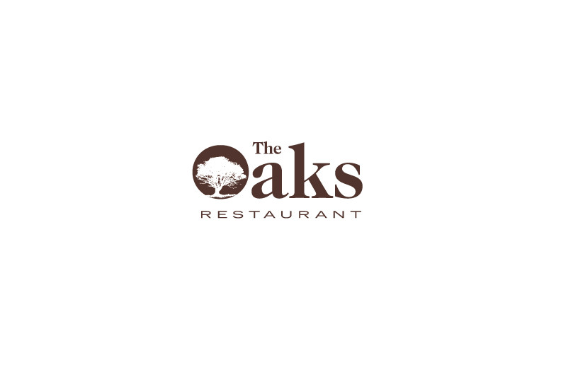
So, here it is, the new logo for “The Oaks Restaurant” fresh off the presses from the design team at Solitaire Creative Services.

Once they saw it, the marketing team knew immediately this was their winner.
Related posts
posts can interested you and are related
Corporate Identity Packages
HOT OFF THE PRESS! A brand new Corporate ID Package for Envision Eye Center. Get yours today, only $470. Includes 1000 business cards, 500 letterheads and 500 envelopes printed in two colors on premium stock.

Our Newest Advertising Work for Our Newest Client
Here is our latest work for our newest client, J.A.M. Specialty Products. The go[...]
Who’s Ready For A Drink?
The Marriott Medical Center Hotel contacted Solitaire Creative to help ramp up traffic in Paladora – their cocktail lounge and casual dining restaurant. To help with the Happy Hour promotions we designed two new graphics for[...]
Get Yer Hot, Fresh Donuts
You know how the best donuts are the ones that have just come out of their bath and been dusted or glazed with your favorite sugary coating? Well the folks at the Rotary House have a new kiosk that cooks donuts on the spot, with[...]
The opening blog
What’s an ad agency to do with its first official blog post? Something serious? Something creative? Maybe just a short and sweet test like this. Any questions?

Logo Design for The Oaks Restaurant
Our longtime client The Jesse H. Jones Rotary House wanted to freshen up their l[...]

Well Designed Postcards Work Magic
Postcards are an affordable way to work magic with your marketing efforts. While[...]
Creativity on Many Canvases
At Solitaire Creative, we are not just about putting ink on paper. Our creative skills extend into the virtual world as well. We offer web design, email marketing, social networking and more digital services. [...]
Leave a Comment
Comments are closed.